Greetings,
I came across this plot, and decided to post it here.

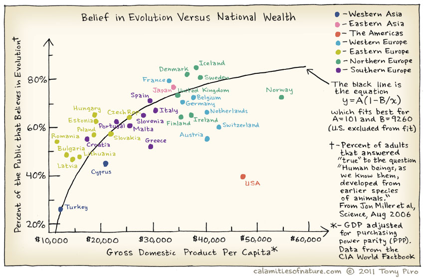
Figure: Plot that shows the correlation between the percentage of the public the accepts evolution and the GDP per capita.
(Source: Calamities of Nature)

So, what can we learn from this plot?

1. The higher the GDP per capita, the more people accept evolution (important note: it's a correlation, not necessarily a causal connection).

2. The acceptance of evolution still has a long way to go (the highest acceptance rates hover around 80%, which means that even here 1 out of every 5 people don't accept evolution!). 

3. Norwegians make a lot of money.

4. Icelanders are the coolest (no pun intended) people on the planet, closely followed by Danish and Swedish people.

5. Something is very, very wrong in the USA.

Old NID
80931

Donate

Please donate so science experts can write for the public.

At Science 2.0, scientists are the journalists, with no political bias or editorial control. We can't do it alone so please make a difference.

Donate with PayPal button 
We are a nonprofit science journalism group operating under Section 501(c)(3) of the Internal Revenue Code that's educated over 300 million people.

You can help with a tax-deductible donation today and 100 percent of your gift will go toward our programs, no salaries or offices.

Latest reads

Article teaser image
Donald Trump does not have the power to rescind either constitutional amendments or federal laws by mere executive order, no matter how strongly he might wish otherwise. No president of the United…
Article teaser image
The Biden administration recently issued a new report showing causal links between alcohol and cancer, and it's about time. The link has been long-known, but alcohol carcinogenic properties have been…
Article teaser image
In British Iron Age society, land was inherited through the female line and husbands moved to live with the wife’s community. Strong women like Margaret Thatcher resulted.That was inferred due to DNA…