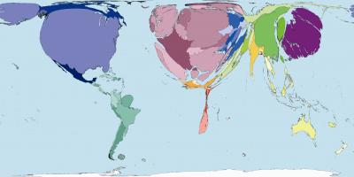
Public Health Spending: Worldmapper Poster 213. Source of data used to create map: United Nations Development Program, Human Development Report 2004. (Credit: Worldmapper)
This is the philosophy behind Worldmapper, a collection of cartograms that rescale the size of territories in proportion to the value being mapped (examples of values that are mapped are public health spending, malaria cases, HIV prevalence, and number of physicians).
Worldmapper Poster 213, for example, shows public health spending--most of Africa appears tiny on this map. Another cartogram (Worldmapper Poster 229) shows global malaria cases--in this case Africa appears enormous.
In a paper in PLoS Medicine, Professor Dorling describes why he and his colleagues launched the Worldmapper project (http://www.worldmapper.org/). The project is a collaboration between researchers at the Social and Spatial Inequalities Research Group of the University of Sheffield and Mark Newman from the Center for the Study of Complex Systems at the University of Michigan in the United States. During the course of 2006, the project aimed to create 365 new world maps, embed them in explanatory posters, and provide raw data and technical notes on many of the most prominent of the world major datasets published mainly by various United Nations organizations. This information is all freely available on the Worldmapper website.
"What I think matters most," says Professor Dorling, "are the new ways of thinking that we foster as we redraw the images of the human anatomy of our planet in these ways. What do we need to be able to see--so that we can act?"
Citation: Dorling D (2007) Worldmapper: The human anatomy of a small planet. PLoS Med 4(1): e1. (http://dx.doi.org/10.1371/journal.pmed.0040001)
Note: This article has been adapted from a news release issued by Public Library of Science.