In the third part of this long piece on graphical displays and their interpretation, I wish to discuss some properties of two-dimensional distributions, which are sometimes called "scatterplots" (especially by physicists), or also "temperature plots" (when colour is used to give a sense of the density of data in the two-dimensional plane). In this post we will consistently label "X" the variable on the horizontal axis, and "Y" the variable on the vertical axis, but there is no hierarchy between them - they should be considered equally important.
In all cases, these graphs are rich with information otherwise hard to display with one-dimensional graphs. The 1D alternative to the scatterplot typically consists in binning data along Y, plotting different histograms of the frequency of X overlaid in the graph. One is then looking at something like the figure below:

In the example shown above, the CMS collaboration used a 1D representation of the production cross section of collisions yielding pairs of jets as a function of the invariant mass of the two jets (Mjj, the X variable) for different bins of a second variable |Y|_max, the maximum absolute rapidity of the two jets. This kind of plot can then be said to display a "doubly differential distribution" of the cross section in X and Y. We can jolly well ignore what rapidity is, what a dijet mass is, and all the details in the figure, as the point is clear: the one above is a valid way to represent a two-dimensional density, in cases when the distribution is smooth enough that the 1D marginals do not create a mess when overlaid to one another.
One should also note, in the figure above, that the scale of variation of the cross section (which is the density, reported as a function of X and for different values of Y) is gigantic - it spans 12 orders of magnitude! I mention this because a scatterplot of the same data would have made it much harder to interpret the resulting graph.
So when are scatterplots useful? In general, they are a great tool to show complex interdependence of the density of the data on the variables X and Y: the simpler is the dependence, or the lack thereof, and the less useful a scatterplot is. Let us in fact consider a couple of examples to bring this point home:
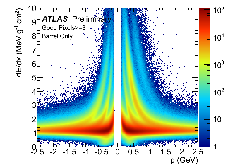
In the first example above, the ionization of charged particles in pixel sensors of the ATLAS detector is shown on the Y axis, and the momentum of the particles is shown on the X axis, multiplied by the particle electric charge. We are looking at a mixed version of temperature plot and scatterplot, as the binning in XY is small enough (and the data concentrated enough) that many bins are empty, or only show one single reading (the ionization dE/dx, which can be read off by the colour of the pixel in the graph). In any case, there is enormous richness of information in this graph, and yet it can all be picked up relatively easily.
The curves where most of the data lay are produced by particles of different properties, which ionize the silicon sensors of the ATLAS pixel detector quite differently for equal value of particle momentum. By plotting the data separately for positive and negative charge, ATLAS also manages to show the excess of alpha particles (helium nuclei), which can be much more readily produced in proton-proton collisions (two positive-charged particles) than their negative-charge analogue (anti-helium). The alphas populate the fourth "density wave" on the right part of the graph, which is almost totally absent on the left.
As you can easily imagine, binning the data above as a function of either X or Y and reporting only one marginal would result in a very messy graph; instead, the interdependence of X and Y can be effectively observed here.
Let us instead look at a second example (an example from MatLab), a graph which shows very little structure in XY, and which is thus less interesting as a scatterplot (but note that there may be valid reasons for choosing this particular data visualization means).

In the graph above, X and Y show a sinusoidal dependence, with some additional scatter. The same information could have been more effectively offered by a band in a 1D graph of Y values versus X, or even a set of averages of Y in fine X bins. Since the functional dependence here is known (or can be assumed to be known), it could have been more informative to directly report the residuals on Y from the function. In any case, here the scatterplot option is much less compelling than in the previous example.
When a functional dependence between Y and X exists but it is complex or not a priori known, the option of showing their 2D distribution is more motivated. Indeed, when one "fits" XY pairs with some function to determine the function parameters, the scatterplot gives a chance to visualize the input data along with the fit results in a way which clarifies how good of a summary the fit is for the data. Take the example below: the data overlaid to the fit curve offer a lot of additional information, e.g. about the variance around the fit in different regions of X. Note that when one is fitting a function through XY data, one is implicitly choosing a hierarchy between X and Y: one may fit Y as a function of X, or X as a function of Y, and the two results will be entirely different, as they answer different questions, of course.
Another compelling reason for choosing a scatterplot to visualize the data is the existence of different classes, which behave differently in the interdependence of X and Y. We saw that already in the ATLAS dE/dx graph above, but there are better examples, e.g. the one below.